
You have already set up your website, designed a brand concept and created breathtaking graphics. Your homepage has been set up for months or even years, and more things seem to have piled on since that beautiful first version you crafted. It’s time to declutter your homepage.
Now, you have started wondering whether you really need all that on your homepage and whether you have the “correct” order or if this is the most effective layout for your conversion rate.
One thing is sure it could do with some cleanup, but how to decide what to keep and what to get rid of? And no, we are not going to base it on whether it sparks joy or not. This is business!
No matter the business, your website’s homepage has two main purposes: to introduce your business and to guide your visitors through the rest of the website.
The content that you use to achieve both of these goals depends entirely on your current business goals, nothing else, not the current trends or your competitor’s website. Only your current business goals will determine the content to use to send a clear message to your audience and get them to explore more of what you have to offer.
No matter the type of business your website’s homepage has two purposes, familiarize your visitors with your business and guide them through the rest of the website.
Let’s get right into it and give you some very essential clean-up points to declutter your homepage.
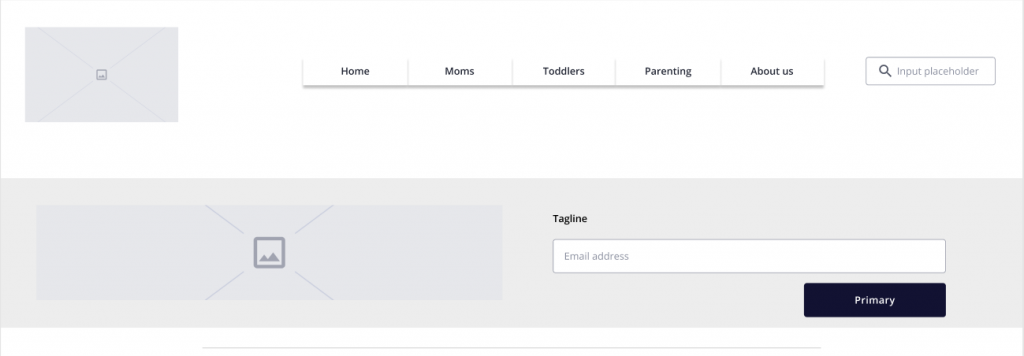
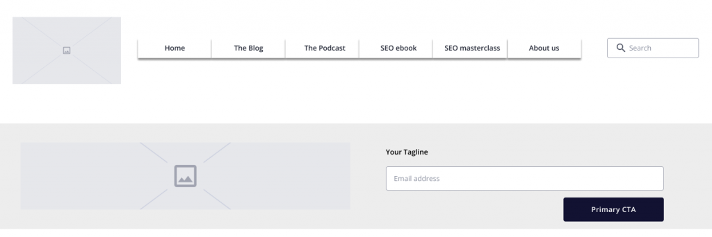
Above the fold
The area on the upper half of your homepage, before visitors have to start scrolling down, is what we call above the fold. This term was previously used to refer to the upper half of the front page of a newsletter ( before it folds :))
Above the fold is the most valuable real estate on your website. Therefore, what you place in that area needs to have achieved, if possible, the two main purposes of the entire homepage.
Remember that 50% of your visitors may never scroll down.
If you want to find out how your visitors are scrolling your website, check out the great tool Hotjar.
What to keep:
- Very clear identity of your brand: Logo and business name.
- Immediate identification or target audience: Slogan that describes exactly what the website/business offers. Do not obscure it; do not make it fancy; make it legible and simple.
- If you have a blog or content that gets updated regularly: Available access to your latest posts/news.
- If you have a social presence: Access to your social media accounts.
- Keep a distinctive above the fold on each section: Your visitor may not even notice that has gone to a different section if your above the fold remains the same on each page. Somehow this practice is happening more and more and it’s very confusing for a new visitor. Plus, you are making your visitor scroll down for no reason at all. It almost feels like all the links are going to the same page.
What to toss:
- Elements that overlap and hide each other: Top bars hide navigation or other content elements.
- Low contrast text or graphics: Not only does it make your visitors cringe and possibly give them headaches, but Google also doesn’t like them either.
- Right-hand sidebars and other elements: Naturally, our eyes are drawn to the left side of the screen less than to the right. The right-hand side is usually associated with ads, so people tend to ignore it.
- Big hero images that push the real content or your CTA below the fold.
Pop-up forms and cookie bars
What to toss:
- Elements that overlap and hide each other. We will repeat this one over and over again. It is very easy to oversee this issue; the more pop-ups and bars you keep adding with different conditions the more difficult it is to get to test all the possibilities. When adding a new top or bottom bar (e.g. cookie bar) make sure it is not covering very important information or CTA.
- Pop-ups that can’t be closed easily. For example, full-screen pop-ups where the close button is not obvious enough or not visible on mobile screens.
Navigation
Navigation is there to make sure that visitors have a crystal clear idea of what the difference between each section of your site is and where can they find what. It is particularly important to make it easier to scan.
Our recommendation is to simplify the navigation, making it easy for the visitors to move around your website. Make sure the navigation is always present in all sections of your Website.
What to toss:
- Link to HOME may not be needed since naturally, users tend to use the logo as a way back home. You can use this real estate for other sections or simply keep a cleaner look.
- Not responsive navigation: If your menus start wrapping in two lines, you may need to adjust your navigation to be responsive. Remember that responsive design is not a nice-to-have; it is a must. (Hint: Google loves responsive design.)
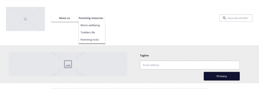
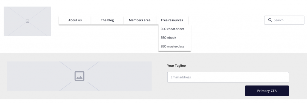
- Duplicates: Multiple entry points that lead to the same content. Some sections may be seen as overlapping and therefore will make it difficult for a visitor to decide where to go next.
- Unclear labels: If it is not crystal clear what your visitors will find under each category/section, you need to rethink the labels used. KISS your menu (Keep it simple, stupid)
Instead of :
Go for:
Another example
Instead of :
Go for:
The important thing is to make sure that visitors have a crystal clear idea of what the difference is between each section of your site and where can they find what.
Headers
To declutter your homepage you not only need to decide which elements to keep or not. You need to have a deeper look into the language you are using and how it relates to your audience, grabs their attention but overall does not confuse them.
What to keep:
- Titles of your sections that are clear, truthful and welcoming
What to toss:
- Titles of your widgets that do not provide a clear indication of the section, for example:
- “Blogging tips” instead of “Inspire someone”
- Section titles that do NOT provide a clear indication of the content behind it.
- Very long titles. Keep your headings very straightforward, for example:
- “About” instead of “About this SAHM lifestyle blogger”
- “Blog” instead of “Mrschettylife writing”
- Top menu items that could be subcategories.
Clean up your content pieces
Use the concept of the inverted pyramid and place the most valuable content at the top and the less critical at the bottom.
How do you define what content is the most valuable? It entirely depends on your current business strategy. What are your goals and priorities?
For example:
- New email subscribers
- Build authority ( recurrent visitors )
- Book new clients
- Highlight new content
- Build a community
For each of the points above, you can define which content will help you to achieve this goal more efficiently.
This will give you an idea of which content needs to be prioritized.
Footer
What to keep:
- Contact details, including social media handles.
- Links to your legal pages
What to toss:
- LinkedIn card
- Twitter feed
- Instagram feed
- Unnecessary space: keep your footer as minimal as possible.
Final tips to declutter your homepage
- Make sure images are sized properly so they fit in your elements and resize properly for different screen sizes.
- Make sure you test your website on the most common browsers and devices.
- You can use tools like Hotjar to track how far down visitors scroll and which elements of your site draw more attention.
Which aspect of your homepage are you most proud of and which one can do with more attention?